Intelligence⁺⁺ had a strong story. It was just hard to find. Two names competed for attention, the visuals sometimes worked against the message, and a tangled structure scattered the narrative into pieces that visitors struggled to add up. The mission and impact, the reason anyone should care, got buried along the way.
To inform our approach, we audited best-in-class nonprofit organizations to understand how they communicate their mission and structure their stories. We also interviewed educators, investors, and funders of the nonprofit sectors, observing how they navigated the site and interpreted the foundation’s name and purpose. The findings revealed consistent patterns of confusion and clear opportunities for improvement.
-Sandy, Director of Career Programs at the AcademY Group
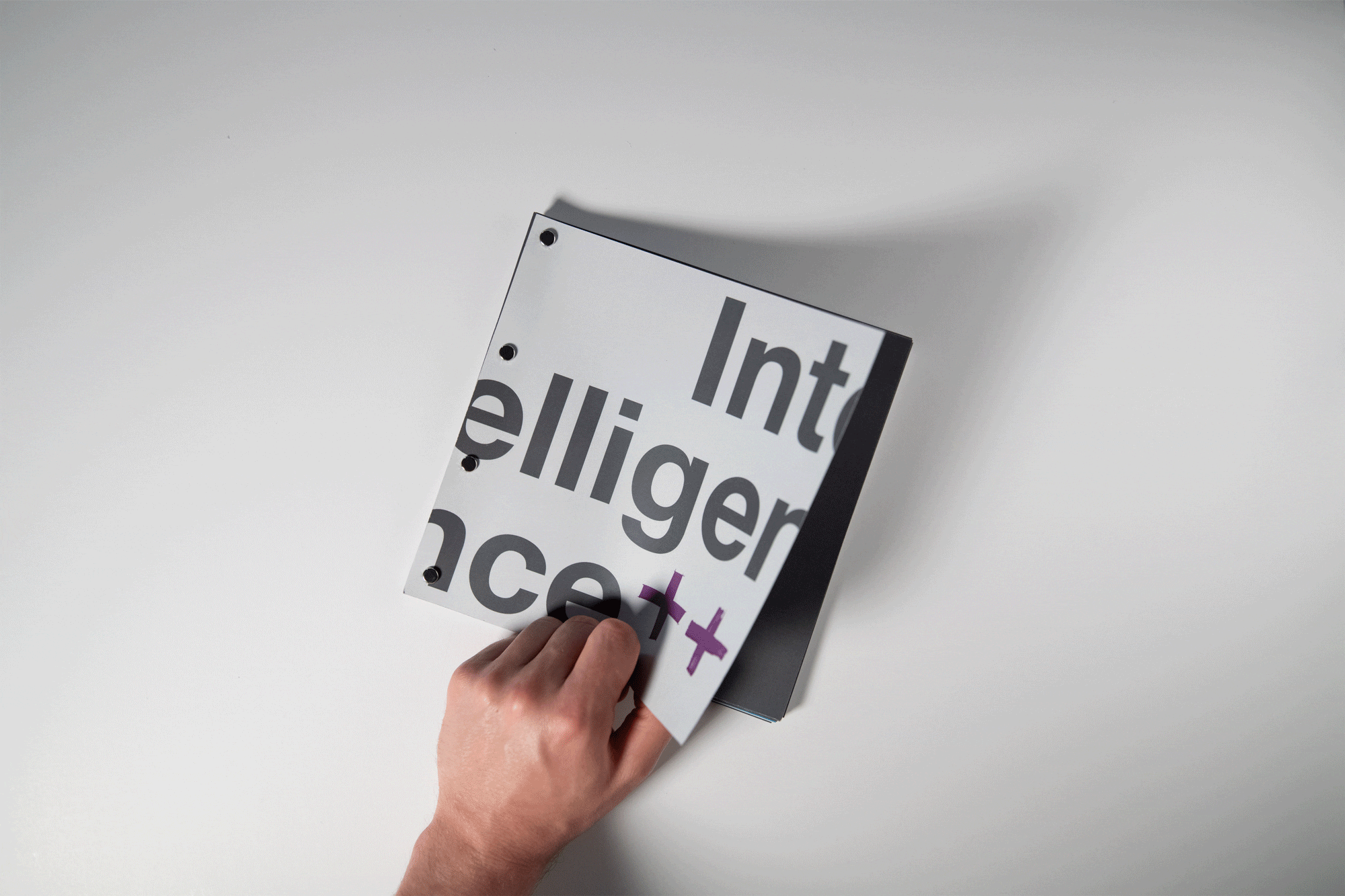
A confusing name
Nearly every participant questioned whether the organization was related to Artificial Intelligence or Reality, shaping their perception before they engaged with the content.
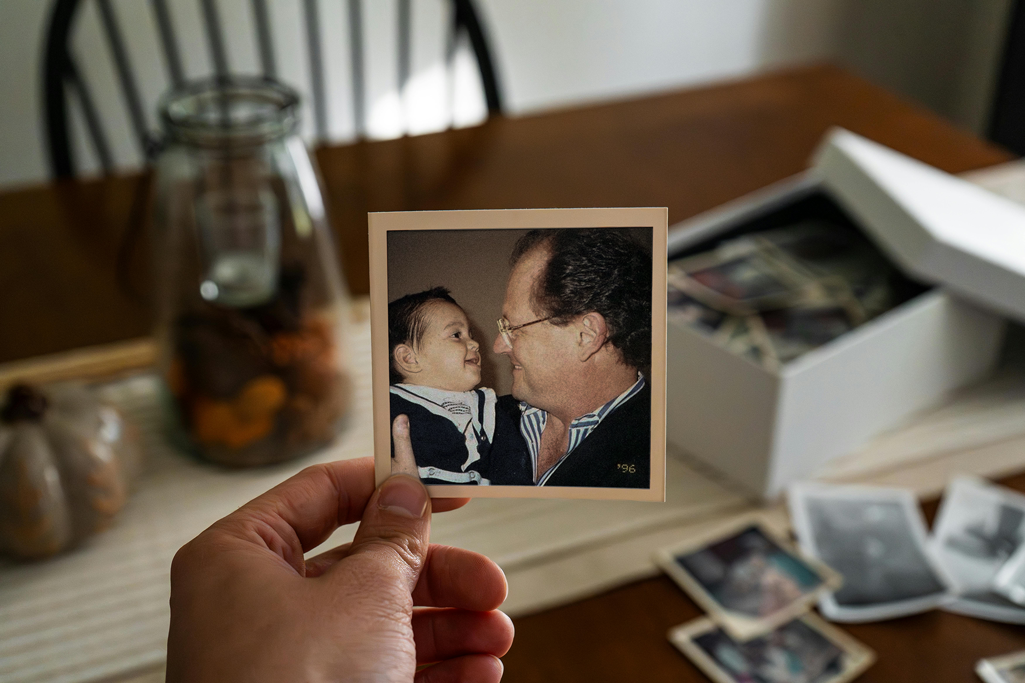
Where are the people?
The site focused on the founder’s story while underrepresenting the community it serves. Without visibility into students, families, and grant recipients, the impact was unclear.
No clear path to engage
The team had ambitions to grow both participation and donations, but the site didn’t support those goals. Visitors expected clear ways to contribute but found no direct pathways or calls to action.
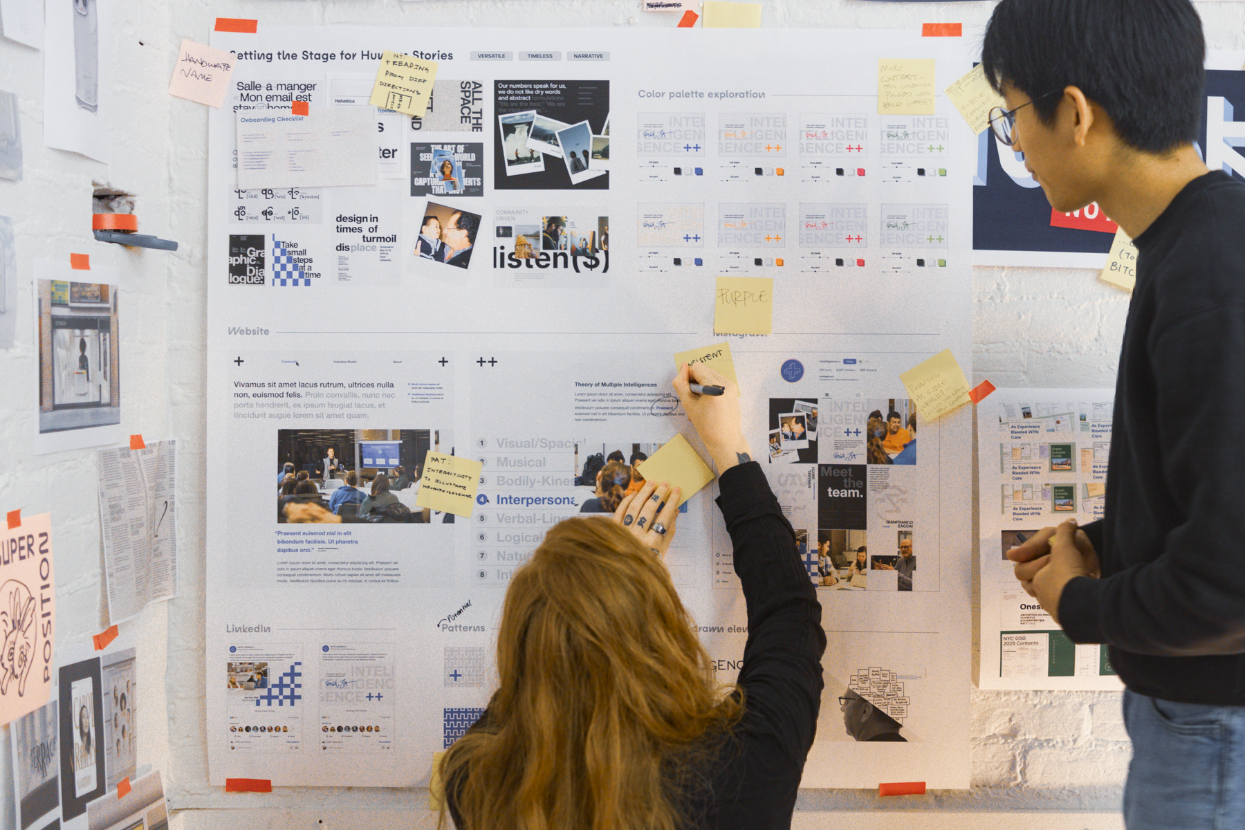
Inconsistent visual language
Multiple styles, shifting colors, and unstructured project documentation made the work feel fragmented and difficult to understand.
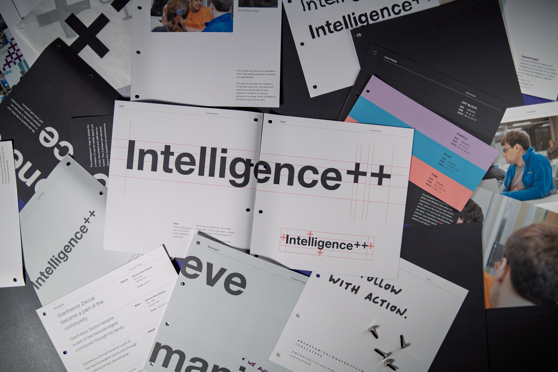
We created a system that reflects both the seriousness of the mission and the creativity of the community it supports.
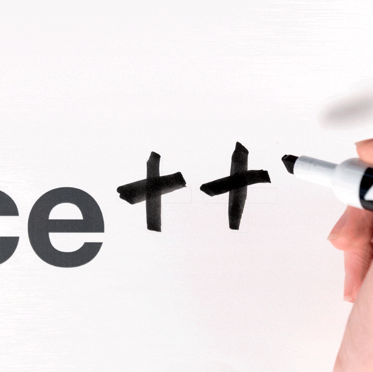
To move away from unintended associations with artificial intelligence, we emphasized the Intelligence++ name and introduced human mark-making into the design system.
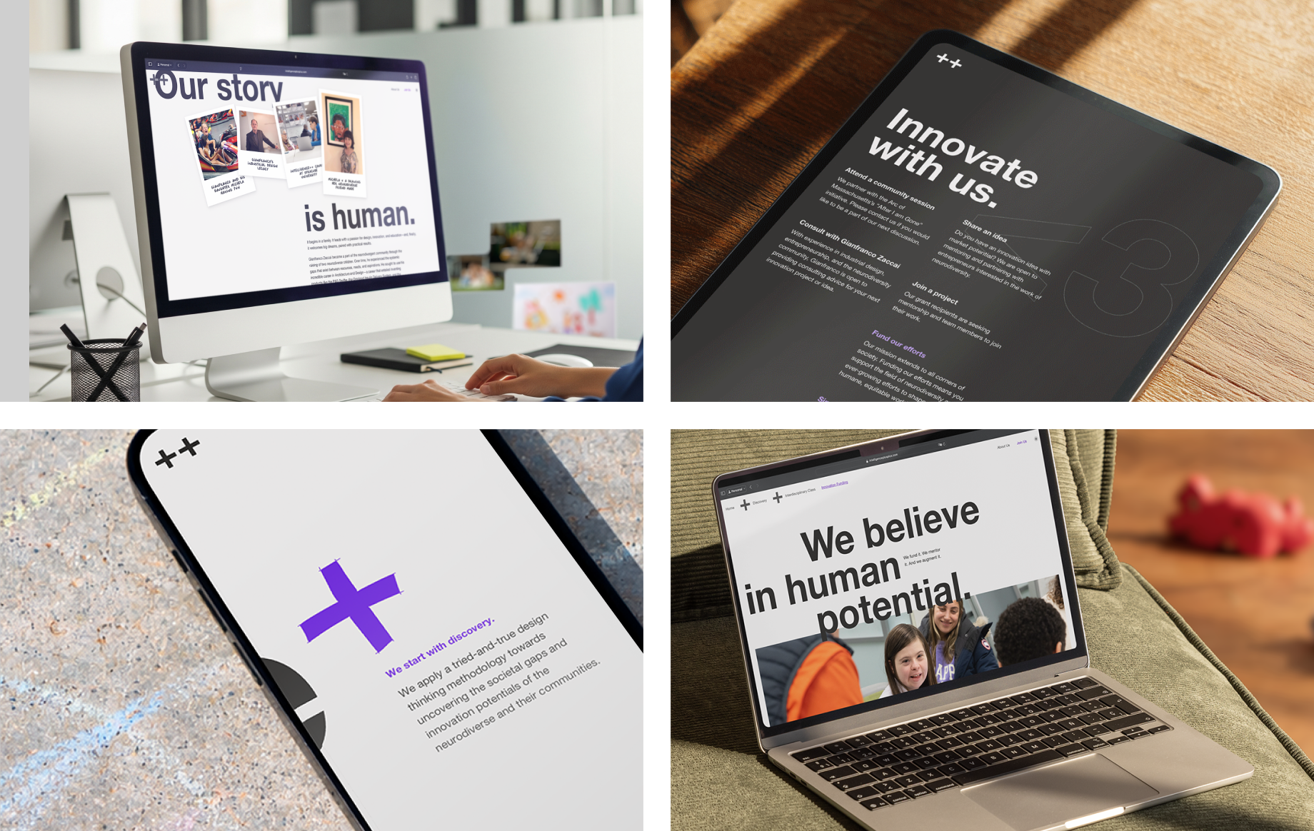
Drawing from Swiss design principles, the visual language built on foundation of Helvetica Neue, a restrained color palette, and structured layouts. The human-element is brought back in with Polaroid-style photography, a hand-drawn typeface, and expressive, sketch-like iconography that brings warmth and energy.
People now sit at the center of the story. Photography highlights neurodivergent and neurotypical individuals working together, supported by testimonials from students, families, and grant recipients.
A simplified navigation structure and clearer page flows make the organization’s mission more accessible, while subtle interactions like hand-drawn logo reveals, animated links, and typographic details introduce moments of delight.
You can visit the new website at intelligenceplusplus.com.
Other Tomorrows
Adam Lewandowicz
Daechan Kim
Ludo Cestarelli
Intelligence⁺⁺
Annabel Smith
Gianfranco Zaccai